The majority of Shopify traffic is now mobile, but many product pages are still designed as if everyone shops on a wide desktop screen. Nowhere is that mismatch more expensive than the add-to-cart button.
The scroll problem
On a phone, a product page is a long vertical scroll: image, title, price, then description, specs, reviews, related products. The add-to-cart button usually sits near the top, just under the price. The moment a shopper scrolls down to read the details, exactly when they're deciding to buy, the button disappears above the fold and never comes back until they scroll all the way up.
That creates a small but constant tax on conversions. A shopper who's convinced by paragraph three of your description now has to hunt for the button. Some scroll back up. Some get distracted. Some just leave. Every one of those is a sale that was ready and got lost to friction.
What a sticky bar fixes
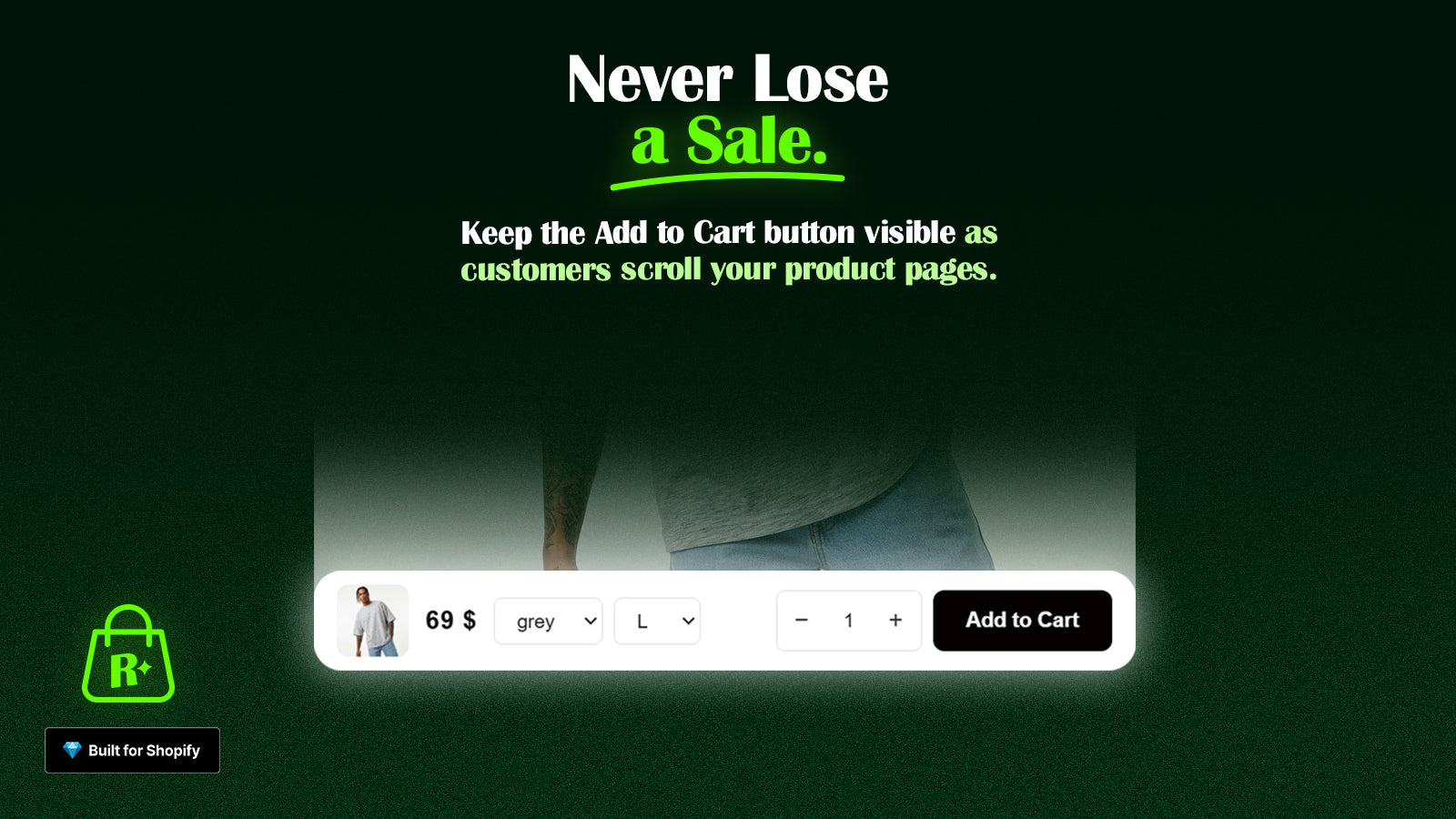
A sticky add-to-cart bar pins the essential elements, product name, price, and the add-to-cart button, to the bottom of the screen as the shopper scrolls. The one action that matters is always a thumb-tap away, no matter how far down the page they've read.
The benefits are direct:
- Zero hunting. Decision made? The button is right there. Intent converts to action instantly.
- Reinforced pricing. Keeping the price visible as they read keeps the value proposition present, rather than forgotten at the top.
- Thumb-friendly placement. A bottom bar sits in the natural reach zone for one-handed mobile use, far easier than stretching to the top of the screen.
Small details that matter
A sticky bar is simple, but a few choices separate a good one from an annoying one:
- Show variant selection when needed. If the product has sizes or colors, let the shopper pick them from the bar (or scroll them to the selector) so tapping "add" never dead-ends in an error.
- Keep it slim. The bar should assist, not dominate. A compact strip preserves screen space for the content that's doing the selling.
- Match your brand. Like every cart element, the sticky bar should use your colors and styling so it feels built-in rather than bolted on.
The cheapest conversion win on mobile
What makes the sticky add-to-cart bar so appealing is its ratio of effort to impact. It doesn't require new photography, new copy, or new traffic. It simply removes a moment of friction that sits between an already-interested shopper and the purchase they were about to make.
If you optimize one thing for mobile this quarter, keeping the buy button in reach is one of the safest bets you can make.